5 Ways to Get Your eCommerce Forms to Convert Like Crazy (+ a Few Real-World Examples)

If you are running an online business, the process of creating eCommerce forms is sure to be entirely familiar to you.
Say, you need to collect email addresses for your weekly best hand-picked deals newsletter. What do you do first thing? Yeah, right, you create an opt-in form. Then you direct your attention to user-experience and kindly offer your shoppers an oh-that-super-short-1-question survey to unlock their deepest thoughts about your products. Yet again, you build a poll form. And, of course, gathering some vital information about your customers upon sign-up is what every online retailer does each and every day through all kinds of lead generation forms.
Building high-converting eCommerce forms is an essential part of your customer acquisition strategy. Done right, they can increase your store’s conversions (of course, with a bit of fine-tuning applied) by up to 120%. Conversely, poor form design with an overwhelming number of fill-in-the-blank fields and unclear call to action is a surefire path to shopping cart abandonment and destruction of all your marketing efforts.
To guide you through the jungles of a poll creation, I’ve prepared a good portion of theory (no mind-bending instructions, I promise!) and a few practical tips about the way you can implement all that with X‑Cart shopping cart. Read on.
Think up a catchy title and a killer call-to-action for your eCommerce form
Any online form, be it an order form, opt-in form or just a questionnaire, is an important gateway between you and your customers’ actions. And if you have ever tried to force your shoppers to take action and loosen their purse strings, you know this is not an easy task. High motivation is what gets them started.
It means you’ll have to torture your brain pretty hard to write the right copy for your form and to ensure your call-to-action button is strong enough to motivate your users instantly. Keep it in mind, that your text should be fairly short and eye-catching. You’ve got only a few secs of your customers’ precious time, so stick to the most necessary info and, if possible, try to ask only for one thing at a time.
Using emotional language also helps. For example, to make your CTA button more friendly and personal, try to replace the default “Submit” with something more inspiring and relevant to your offer, like “Grab it now before it’s too late” or “Let’s start”… or even “Follow the magic”, why not? Make your words swing, swirl, hop, skip and dance. Believe me, your eCommerce business is worth it.
2. Remove all doubts to build long-lasting trust
Perceived fear and doubt in the mind of customers while shopping online is, by no means, a real problem for eCommerce industry. It is 2018, but still, there’s an impressive number of online users who are afraid of shopping online. They may have never bumped up against online fraud yet, but, you know it pretty well, that the unexplored is the most frightening. And that’s the reason why a significant part of your potential customers still prefers to steer away from any purchases processed through online payment gateways.
However, this tough problem is also quite manageable. Let’s take a blog signup form as an example. What can frighten your users so much? Probably, tons of spam, that is going to overload their mailbox. Hidden charges can also be the source of their anxiety. Such lines as “No charge. No spam. Unsubscribe anytime.” or, as Facebook fixed this problem, “It’s free and always will be” can help here. What is more, implementing this rule on checkout can significantly lower your shopping cart abandonment and take your eCommerce website to the next level.
Do you see the point? Think of what your users are afraid of. And conquer their doubts.
3. Ditch unnecessary form fields
Every field you ask them to fill increases friction, so think twice before forcing your customers to fill in a super-duper short survey with really simple 378 questions in it. Come on, do you really believe you need all that data? And now to be serious. Remember the following universal rule — less is more, which simply means that the fewer form fields you leave, the more conversions you get. If it’s a registration form or a contact us form, in most cases, you don’t need to ask for anything but the email address and a name, the latter one can also be dropped. No billing addresses, no credit card details. No, no, no.
Have a look at the picture above — what’s the first thing that comes to your mind? It looks like I already hear your thoughts ? This “Contact us” form — just a “contact us” form, to let you ask them a question or two, yeah — looks like a security questionnaires for Counter Terrorist Check, huh. You see, there are two (!) address fields and postal code. Are they going to send you a reply by post? Taking into account that their eCommerce business is connected with athletic goods, not a secret weapon, this is rather awkward.
Ok. There are some types of information that are more nice-to-know than need-to-know. And if you want to add certain fields, do it, but, please, remember to mark optional and required ones.
4. Place your form on the most visible place
In copywriting, it is a commonly-used practice to put the essential information first. The same goes for eCommerce forms — what sticks out gets chosen. So, to make your registration form work for you the right way, you need to choose the most visible place and stick your form there.
Use heat map and click-tracking services, like CrazyEgg or KissMetrics, to get insights on your users’ behavior and to spot the “hottest” place of your page. The brighter the spot, the more clicks it received. Try it, it’s fun!
Placing your opt-in form above-the-fold is considered to deliver the highest conversion rates, as a user sees the above-the-fold content first before he scrolls down for more information. Anyway, the place of your form should also be carefully tested. And that’s what the next paragraph is about.
5. Test it
There’s no use wondering which form converts your site visitors into paying customers better — the one with an extra large pink button or the one with an impressive copy. You won’t guess it anyway. Instead, you can run an a/b test or a split test.
Here at X‑Cart, we use Optimizely. It allows us to experiment with the website’s interface. As a result, we not only managed to increase our sales and on-site time by making our payment gateway more appealing but also made our users fall in love with our e-commerce solution.
By the way, did you know, that New York Times subscription form used to be 18 pages long when they first launched their web presence back in 1996? I’m not sure there were any a/b testing tools 20 years ago. Hopefully, you don’t need any tests to understand that that’s too much for a single subscription.
Ok. That’s enough theory for today. Let’s get down to practice
Now, that you know a thing or two about web form usability, it’s time to put your knowledge into practice. Let’s see how we can do it with X‑Cart PHP/MySQL/Bootstrap-based eСommerce solution.
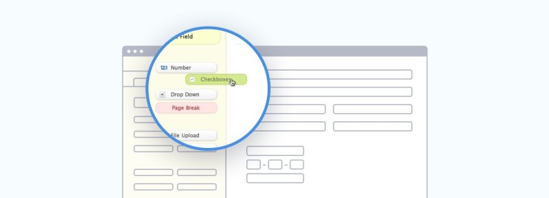
Adding Wufoo forms to your X‑Cart store is a breeze. First, you’ll have to log in to your store back-end and enable a Wufoo app (it now works with X‑Cart ver. 5.0.x – 5.3.x, but can be fine-tuned for X‑Cart 4, if you like) in the X‑Cart Marketplace. Then, go to the Wufoo website to create a form. Due to drag-and-drop functionality and a wide range of tweaking options, you’ll be able to create a great web form design and customize it all out, with no coding or hassle at all. When everything is ready, go back to your store back-end and add your eCommerce form to any static page in your store in one click.
“Contact us” form
I’ve created three types of forms. The first one is a “Contact us” form. A reasonable number of fields — a name, an email and message fields — won’t drive your customers mad. Moreover, it’s quite clear what is going to happen after the form is filled — “our sales rep will be in touch in a few seconds”.
Newsletter subscription form
A clear call-to-action and a limited number of form fields here (just one, hah!) are considered to increase your store’s conversions by times. Plus, customization options are available here to make forms even more authentic.
Product order form
Good news for online retailers is that Wufoo allows you to create online order forms to give your customers an additional way to buy products from your e-commerce website. Yes, adding an order form into a shopping cart sounds a little bit silly, but still, it can be quite useful. For example, apart from selling art supplies, you may regularly arrange workshops, so you can easily sell tickets on a separate page. Or else, you are writing a post about complementary goods from your partners, so you can add a payment form and make your customers enter their credit card data right into your article. Isn’t that great?
Add a payment integration feature on your form, choose a payment processor (I’ve chosen PayPal Standard), currency (I’d like my users to pay me in dollars) and make a few more settings. I decided to assign prices based on choices a user selects. That’s it.
A little bit more about using Wufoo app with X‑Cart shopping cart
- Use pre-designed online order forms to save time. Wufoo offers more than 400+ customizable templates for a variety of business types. Just grab the one you like most and embed it into your X‑Cart eCommerce site. Use rules to create dynamic forms that will follow the logic you specified.
- Accept credit card payments securely. Easily integrate your payment forms with such trusted payment processors like PayPal, Stripe, and Authorize.net. From 256-bit SSL encryption to smart CAPTCHA, Wufoo takes care of your data security, so hackers won’t be able to reach data submitted into the form.
- Track performance with dynamic analytics dashboard. Powerful report builder will help you understand the collected data better and get insights about your audience.
- Easily add a form into your store. WYSIWYG editor will let you add forms in a few clicks by choosing them from the ‘Wufoo forms’ dropdown in the settings menu.
Conclusion
If you’ve worked your fingers to the bone to make your eCommerce forms convert, but still see no results, I believe this checklist should help you a lot.
Just follow these simple steps and soon you’ll realize that done properly, forms do work.

Helen is an SEO and Content Marketing Specialist. She has been creating and planning content for over 10 years, with 5+ years specializing in eCommerce.
