
Why You Should Stop Being Mobile-Friendly and Go Mobile-First


It’s been almost 3 years since Google rolled out its mobile-friendly algorithm which gave an additional boost to mobile-optimised websites and the shivers to webmasters’ spines.Ugh.. ?
Then, on November 04, 2016 it announced the so-called “mobile-first” indexing, making the mobile eCommerce experience even more crucial to organic search performance. According to this new rule, mobile users are now the #1 priority and the desktop web is an afterthought.
Here’s what Google Webmaster Central Blog says:
To make our results more useful, we’ve begun experiments to make our index mobile-first. Although our search index will continue to be a single index of websites and apps, our algorithms will eventually primarily use the mobile version of a site’s content to rank pages from that site, to understand structured data, and to show snippets from those pages in our results. We understand this is an important shift in our indexing and it’s one we take seriously.


Sure thing, Google was not going to stop there. On March 24th 2018, after a year and a half of thorough testing and experimentation, Google team officially announced that they began rolling out the mobile-first indexing to more sites. The long-looked-for mobile first index is expected to go live later this summer, in July 2018, to be exact.
Having said that, we continue to encourage webmasters to make their content mobile-friendly. We do evaluate all content in our index — whether it is desktop or mobile — to determine how mobile-friendly it is. We’ll continue to monitor and evaluate this change carefully.

Indeed, this is a huge change in indexing. And even if you have already coded your fingers to the bone to make your store perfectly optimized for mobile, there are still things your business needs to be prepared to. In order to make your life easier, we’ve thoroughly scrutinized Google’s recommendations, picked the most relevant and adapted them for X-Cart users.
Read on.
How can I check if my store is at least “mobile-friendly”?
Google it (not literally)

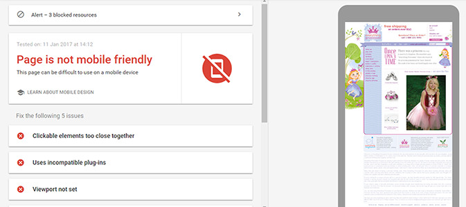
To make sure that your page meets the mobile-friendly criteria, run Google’s “mobile-friendly” test. This is an easy thing. Simply copy & paste your website address here and wait until robots assess your website.
If you are a webmaster, you can open Mobile Usability Report to get a full list of mobile usability issues across your site. If there are such components as flash-based bars and pop-up banners; or clickable elements are not far enough apart to be easily tapped on; or you make your users scroll horizontally — the test is failed.
Your X-Cart version can give you a hint
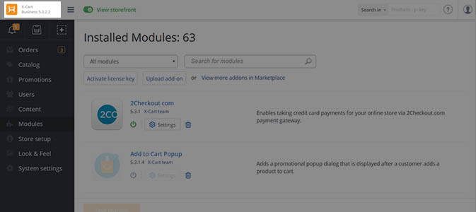
Login to your store’s back-end to find out which version of X-Cart you are currently using.
If you own any X-Cart 5 edition (Business, Multivendor, Ultimate or even a free one), give a high five — your store is mobile-ready out-of-the-box. You have either a mobile or (if your version is higher than 5.1) a fully-responsive skin installed. Anyway, it’s ok.
Registered your X-Cart license more than 4 years ago? Then you are most likely still using our Classic edition. Here you could either buy a mobile skin or install X-Cart’s Ideal Responsive theme, that easily adapts to your customer’s screen, so lucky you are.
But. If the version is earlier than 4.4, then your website is unlikely to be mobile-friendly or responsive at all, alas. This is where you have to drop everything and finally start thinking about your users.
Still not sure? Contact us at any time, we’ll help you to find out whether your store is ready for mobile era or not.
Ok. How can I make my store “mobile-first” now?
Here are four steps you can take to optimize your site for Google’s mobile-first index:
1. Analyze your code and improve it

The first thing you should do to make sure your store meets the latest Google requirements is to test your store’s data to the full. These 3 free tools can help you greatly:
- Use the robots.txt tester to ensure your mobile version is accessible to Google bots and indexed properly. If there are multiple versions of the same page in your store, you should add the rel=“canonical” tag to help Googlebot index a specific version. Or how else will search engines guess it?
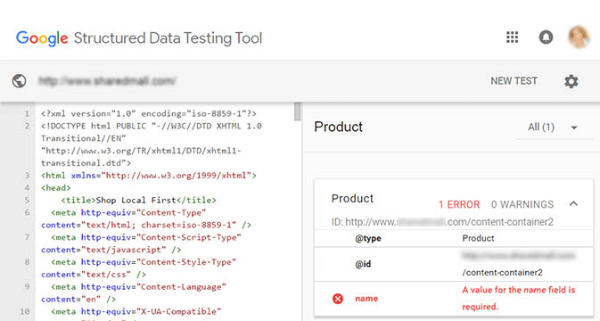
- Type the URLs of both desktop and mobile versions into the Structured Data Testing Tool to compare their structured markup. If the content and markup of your site is different on mobile and desktop, you should fix it. But avoid adding any markup that isn’t relevant for mobile sites.
- And yes, if you’ve already verified your desktop version, don’t forget to do the same for mobile version as well. It’s crucial from an SEO perspective.
If you are an SEO enthusiast and your inquisitive mind hungers for more, you can read this detailed mobile SEO guide. It is written by Google specs and is made to help search engines understand your site better.
And here’s another guide on eCommerce SEO created by the X-Cart team. It covers everything from keywords research to local SEO.
Anyway, our SEO Guru will be thrilled to give you some tips on this as well.
2. Make sure your store loads fast on mobile
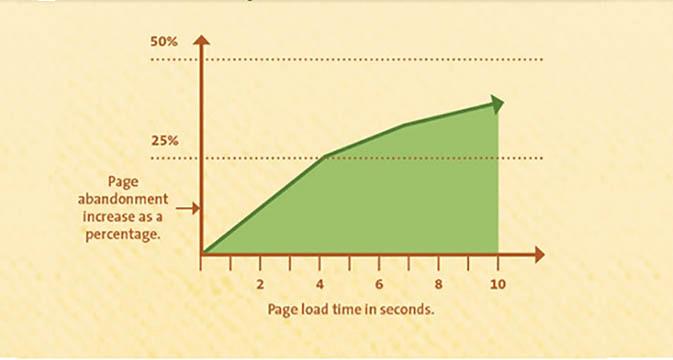
Back in 2010, Google reported that website performance would become a ranking factor. And while 7 years ago speed of mobile pages didn’t impact mobile rankings, now it does. Greatly. So, make sure your store is speedy enough to meet the needs of our forever hustling society. Here are a few ways to do it:
- Ask your hosting provider to upgrade your server PHP version to PHP 7 (don’t forget to patch it if necessary). It will make both your store’s desktop and mobile versions as quick as lightning. If your hosting provider can’t sort this out, you are always welcome to try X-Cart fully-managed VPS Hosting. Our hosting specs will make your store fly.
- Smaller images should drastically speed up page load time, so take time to reduce the size of your product pics.
- Speed up your store by minifying CSS/HTML coding — code that is easier to read is also simpler to interpret.
- Endless redirects and disabled browser caching can significantly slow down the loading experience. Get rid of redirects and enable caching.
3. Rethink your mobile design from the ground up

Mobile first isn’t just about making a web page fit a smaller screen. It’s a bit more. The first thing you have to do is to forget that the desktop environment exists and turn your attention towards the mobile user. He is most likely running somewhere at the moment, browsing your store on-the-go, on a small screen, with unstable internet connection and the sun, dazzling his eyes, causing poor visibility. Not an easy task, hah? Here are a few points you should remember going mobile first:
- Humanize your store’s navigation — it should be clearly marked and easily used. Try to use off-canvas category menu instead of a fixed one. Add expandable widgets to hide infrequently used elements, like “Contact us” form or chat button. Use AJAX calls to let your users interact with the content without refreshing the page.
- Design for the finger, as the finger is much wider than a mouse cursor. You need to enlarge touch targets and make all clickable design elements easier to tap. Extra taps are annoying. And there’s no room for error.
- Avoid huge animated pictures and tiny font-size — complex flash-based graphics clutter small screens and small texts are barely readable. Instead of flash, you can use HTML 5 or Java, they work faster.
- Get rid of pop-ups and hovers — there’s no place for extra blocks and no hover control for fingertips yet, so don’t use it.
- Configure a viewport and size your content to it. Images shouldn’t go offscreen, text blocks shouldn’t be cut off. Otherwise, your users will have to spend extra two seconds to scroll left or right, and horizontal scrolling is a “taboo” for mobile users.
I just tweeted Gary Illyes about this, and he confirmed that even though Google will index desktop content, desktop versions will be devalued in favor of the mobile version. So if your mobile version is smaller than desktop, that’s a big problem. ?

If some of the above points seem too complex for you, welcome to apply to our design experts. They are always ready to help.
4. Prioritize your content
The mobile-first approach is tightly correlated with user-friendliness. In 99 out of 100 cases mobile users come to your store to take a certain action — learn info, buy a product, contact sales and so on. So let them enjoy this process!
- Choose the most important elements and display them higher, delete unused tools. Don’t let them distract their attention.
- Focus on content, not on design. Sort all the information into primary, secondary and tertiary content. Remove irrelevant blocks.
- Make sure your content answers questions in no time. That’s what your users are there for.
Final thoughts
When you end playing with your store, don’t forget to test it in a real device — iPhone mobile phone or Android tablet. Tap through pages. Is it easy to navigate? Are the elements loaded and clicked flawlessly? Have a look at your content — is it readable on a small screen? Test it.
Summary
There are a lot of roads to make your store “mobile-first” with X-Cart. You can go responsive or apply a perfect mobile skin, tweak your titles and meta tags or improve your page load speed. If the do-it-yourself method is not your cup of tea, we are always ready to assist you. Contact us if you want your site to befriend Google and comply with the latest “mobile-first” tendencies.
Now, what’s holding you back? Don’t let “mobilegeddon” swallow you alive and take action immediately!