


3 min read
Why Website Color Schemes Matter & How to Use Them Right

17 min read
This blog post was originally contributed by Georgi Todorov, the founder of ThriveMyWay, on behalf of DigitalNovas.
What if I told you that you could grow your business and have a beautiful website by selecting the right colors?
People are shopping online more than ever now, and they love it. It’s part of their daily life, and the click of a button is comfortable and feels like a real-life experience.
What does this mean for your ecommerce business?
That with the best website color scheme you can:
- grab attention;
- engage your target audience;
- give people what they want;
- turn them into customers;
- let them tell their friends about it;
- and make visitors
of your website fall in love with your brand.
When a potential buyer lands on your website, he has many small decisions to make before the actual purchase. All the elements on your platform are affecting his choice. And it’s up to you to point him in the right direction.
One such element ecommerce entrepreneurs still neglect is the color scheme of their website.
Visual content matters in the ecommerce world, and so does color.
If you think about it, you will realize that you’re affected by color on the Web all the time. Each color palette evokes emotions, puts you in a certain mood. Then takes you on a journey by reminding you of certain things from the past, or making you dream about a brighter future.
It’s not just about the main color you choose and what you complement it with, but how you combine and contrast these and where you add them on your ecommerce website.
In fact, a change in your color scheme can be the solution you’ve been looking for. When you choose the right colors, you will finally express your vision to your visitors and inspire them, while gaining trust and turning them into repeat customers.
I. Color 101: Getting Started with Website Color Schemes
1. Checking out the competition
People associate colors with emotions. While we might think that no type of advertising can affect us – the ecommerce entrepreneurs, all that matters is what the customer thinks and what they act upon.
The primary color they see on your website (which will also be the promary color of your brand) will become one of your most powerful visual assets.
If you’re a brand with a strong message towards all gentlemen, like DollarShaveClub, you’ll want strong colors, each of which grabs attention. That’s what they are doing with their website.

They are selling razors. What makes them stand out from all other companies doing the same, though, is the way they tell a story, use video, and have a unique value proposition.
Additionally, they have a stunning website, speaking directly to their target audience. It’s stylish, with just enough white space, and a dark background at the same time.
Another example of using dark web design color would be Nescafe.

They are not afraid to share their message with the world, and use black (which is connected to power) to complement their brand color brown.
Brown is a beautiful color that we connect with all natural and organic products. It also evokes a sense of comfort and reminds us of home.
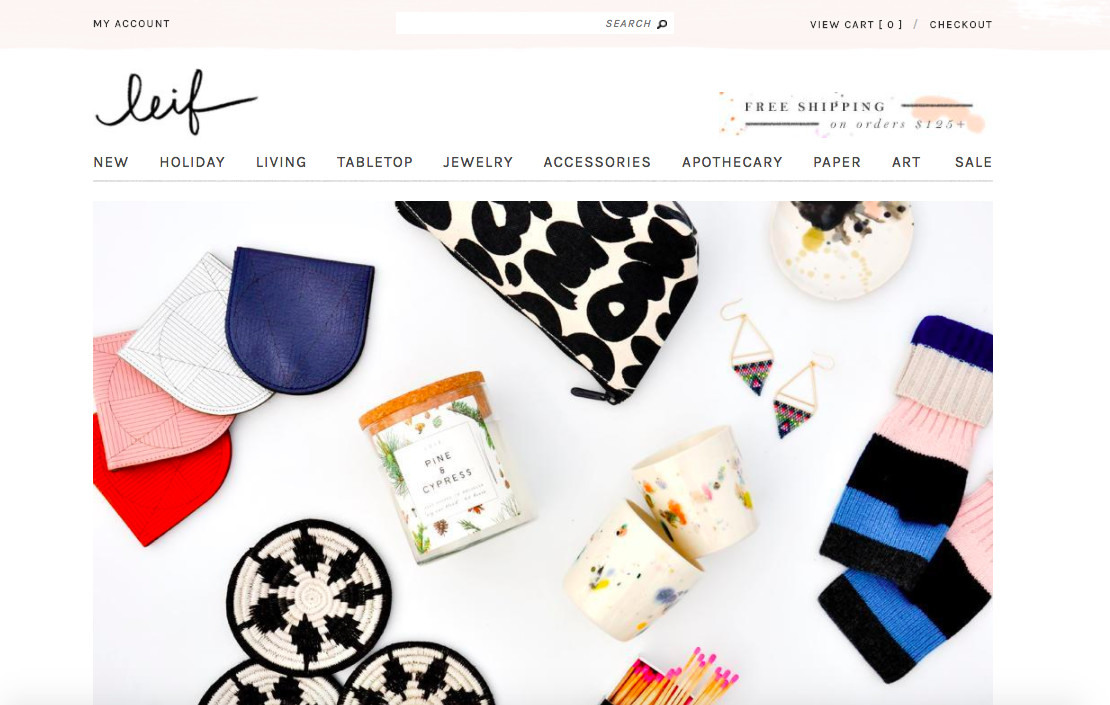
Let’s move onto an ecommerce site that plays with muted tones in a creative way. That’s Leif.
You can see a beautiful homepage layout, with
So, what’s the point of all this? That you need to know what you want to express, to be able to state your value proposition, and to know exactly why you do what you do.
People don’t buy what you do, they buy why you do it.
2. Colors based on the industry
Each color sends a different message depending on the market you’re in.
The logo of HomeDepot, for example, is orange. Their goal is to make customers associate them with good value. In their case, that’s quality goods at a low cost.
 The logo of HomeDepot, for example, is orange. Their goal is to make customers associate them with good value. In their case, that’s quality goods at a low cost.
 But we can also see that in Fanta’s vibrant design. Here orange represents the friendliness and energy of their brand, and also serves as a call to action.
Checking out the competition, once you’ve done it in general to get a feeling of the psychology of color when it comes to branding, is something you need to do again, but in your industry only.
See what competitors are doing and what colors they use on their website to present products. Examine the design trend in each field. Define how it makes you feel, and what their target audience might be depending on their website designs and color schemes.
In case you’re thinking of rebranding or you just need a logo, here’s our guide on logo design. The best logo makers, tips, best practices are there.
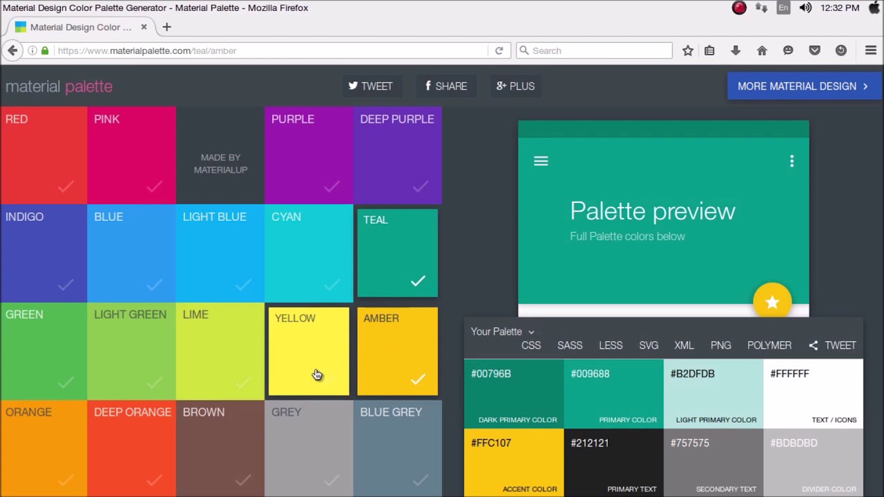
3. Color Tools
Here are the 5 best website color schemes:

The color theory behind each is pretty simple, and there are even free design resources with color wheels that let you see how your combination looks like. Here are some of them:
- Adobe Color CC – The color scheme creator by Adobe can help you with any website design project. There you can play with the color wheel and check out different combinations. Or use one of many color themes (with hex codes) they have for you.
- Paletton – starting with a base color, this tool will help you find complementary colors.
- Color Hunter – this one works a bit differently, as it uses images (you can upload your own) to present color palettes.
- Colors Design Wiki by Canva – this tool will teach you everything you need to know about colors, their meanings and the many color combinations that will hopefully give inspiration to your next design.
- Color Calculator – this interactive color wheel will show you which colors work together and why.
Let’s move onto putting these visual elements on the right places on your platform in order to present your new color scheme to the world.
4. Where to use color on your website
Luckily, with so many examples at your fingertips, and the ability to see exactly how close competitors are doing it, it shouldn’t be hard to choose the colors for your brand and website scheme. Plus, you can add a unique and personal touch to them that speaks to your audience.
However, it’s important where you put these. The first place is the logo, of course. But what else? That’s something most ecommerce entrepreneurs often wonder about.
Here are the key items on your website where you should place your new color palette and let each color affect the visitor in a particular way, while slowly turning them into a loyal customer.
5. Images
Ecommerce is all about product images, and when these are on your website, they become part of the big picture. That’s why it’s worth taking a closer look at your overall strategy.
Are your pictures professional enough? Can you make them more minimalistic? How do you group products on a page so that the whole layout doesn’t appear cluttered?
Even when it comes to black and white we need to be careful about combinations. Here’s a black and white photography guide that you might find useful.
Investing more time into creating and placing images on your website can be especially beneficial in the travel industry. After all, you can make people imagine like they are already on a vacation while at their laptops. An example would be Africa Travel Resource:

6. Buttons
The color of a button is a turning point in the lead conversion process. Fortunately, it’s also something that we can easily test.
You might find this button color A/B test by Hubspot interesting.

The result was pretty clear. By changing the color from green to red, they saw a 21% increase in conversion. While it might be a bit aggressive in some situations (in real life, and in design if there’s a lot of it), in this case (with a clean layout and enough spacing) it’s eye‑catching.
The moment you open up a page like that, you can’t help but immediately notice the striking red button.
But green is what most websites owners prefer for their buttons. It fits nicely with almost any website design, brings a sense of calmness and peace, and is natural. We’re used to seeing it everywhere around the Web. In the situation above, however, it simply didn’t grab the visitor’s attention.
7. Background
A light‑colored background is a common choice for website color schemes, especially in the ecommerce industry. That’s because you have other elements on the website and the products themselves that you’ll want the customer to concentrate on. So the white space on the back (or any light color palette) won’t distract them from the real reason they landed on your site.
That’s how Adidas does it, for example:

At the same time,
Like this Swiss company:

8. Headers
Last but not least, some ecommerce website owners believe in the power of highlighting their headlines. For that, they use their secondary or accent color.
Here’s how Walmart

II. Demographics: Analyzing Your Audience
The next thing you need to consider is your demographics.
Who’s your average buyer and what colors would evoke the emotions you want to in them?
1. Gender
There are a few aspects to this. First, it’s the gender. While you might appeal to both and have products for the general public, if you’re more of a feminine brand you can do like Sephora.

They are in the beauty market, targeting females. Pink is one of the most common choices for such brands as it’s romantic and speaks directly to women and young girls.
The clothing industry that targets females is also using pink quite often, and in interesting ways. Victoria’s Secret is one such example.
How their shades fill the page is true design inspiration.

What about men? In them, we’d like to evoke different emotions, and make them feel strong, instead of gentle as it was in the 2 examples above. At the same time, however, both genders want to feel confident and sexy.
Everyone has a favorite color. So let’s take a look at the different favorite ones of men and women. Here’s a diagram by Joe Hallock that was part of a research.
2. Age
The next main physical characteristic of your audience is their age group. Would you like to appeal to seniors, young girls, men in their 30s, or else?
People’s color choices change with age and the best website color scheme is created with that in mind. So what you show to 18-year-olds, can’t be the same as the content presented to those at the age of 35.
Neil Patel created a chart presenting people’s favorite color by age group.

These first steps will help you decide on your dominant color that’s the foundation of your website color scheme.
Once you know it, you’ll also need to combine it with a secondary one, or even more than one. Let’s see an example with 2 feature colors.
In the case of McDonalds, that’s yellow, which we associate with optimism and warmth. It’s on a red background that speaks to young people and evokes excitement, while grabbing attention boldly.

III. Combining colors
There’s a concept in web designing (and design in general) called the 60‑30‑10 rule.
In a nutshell, it states that 3 is the right number of colors you should choose when decorating a place. Use these as follows: 60% for the dominant color, 30% for the secondary, and 10 for the third one (which is the accent color).
That’s something you’ll see quite often on ecommerce websites. Some of the most beautiful color schemes are triadic.
While this is not a must and doesn’t mean you necessarily need to add an accent color to your palette, it is a good idea to mix things up and include yet another emotion that makes your overall message more powerful.
Here’s a good graph showing how the 60‑30‑10 rule works.

A good rule of thumb when choosing the other colors for your brand is to get familiar with the color wheel. That’s a chart representing the relationships between different colors.
Some experts advice to pick colors positioned next to each other on the wheel. We call that analogous color scheme. And you can use it with subtle shades, or combine darker materials and colors to create unique combinations.
You’ll also hear graphic and web designers advising you select opposite colors that seem to be a good fit together. The options don’t end here.
By now you must have figured out the ‘why’ behind your ecommerce business. You know your market and competitors well and have defined the age group and target audience. Now that you are sure about the dominant color, start creating your second one. Include the accent color here and there too.
When it comes to digital marketing and selling things online, color can be considered one of the most crucial elements. While it’s directly related to conversion, let’s see where it all began and what happens in the mind of a visitor the moment they land on your ecommerce website.
IV. The Psychology Behind Color
Psychology – the study of human behavior – is a pretty handy skill if you’re selling online. It’s worth learning what goes on in the brain of somebody who lands on your platform for the very first time. It you’re not aware of this, chances are you aren’t achieving the result you want.
In fact, you might even be hurting your sales if you haven’t paid close attention to colors on your website and optimized them according to your goals and intention.
If you think good website design is expensive, you should look at the cost of bad design.
If you want to be a successful ecommerce entrepreneur, you’ll have to know how consumers think and why they do what they do online. That’s when color psychology can help you out.
Don’t leave anything to luck. Make changes to your site design and online store according to what science shows is working.
For a start, there’s the fact that every person has a favorite color and that affects them more than anything else.
Then, it’s key to know what each color radiates, as it leads to creating a certain feeling in the visitor and putting them in a certain mood.
Harmony, wisdom and relaxation, for instance, connect to green. It’s one of the most natural colors schemes for websites.
It’s impactful. And what makes it a brilliant color is that it will calm down your target audience. One of the reasons being that it’s in the middle of our visible spectrum and so it takes little effort to recognize it.

Here’s how it looks like on WrightWoodFurniture:

And here’s how Trunkster – a brand selling suitcases – have used yellow as their dominant color (more on how to choose your primary color below).

Yellow is cheerful, which makes it a great choice for your brand color. It evokes a feeling of warmth and optimism. What’s more, it stimulates the nervous system and grabs attention.
Having a ton of white space is something you’ll also notice quite often in ecommerce sites. In fact, most prefer to stick to a white background, while using complementary colors for particular elements.
A neutral background might be basic, but it doesn’t lead to clutter. After all, people are there to enjoy the content. There must be enough empty space so that the visitor doesn’t get distracted.
However, your main colors are a great way to focus on important elements of the page. Such as your logo, an email opt‑in, a button you’d like them to click where you invite them to learn more about a product or get in touch, and more.
In color psychology, white means purity, innocence and perfection. We connect it to new beginnings, sophistication, simplicity and peace. All these are pleasant and make us feel good.
Always include white on your pages. It helps users consume the rest of the colors and the content on the website more easily.
1. The color palettes you’re using say a lot about your store
Choosing a color combination is actually yet another branding choice, but many website owners tend to forget that. Truth is it’s one of the most important decisions you’ll have to make related to your brand identity.
Let’s see how website color schemes result in maximum brand impact and affect sales.
2. How Colors Can Lead to Conversion
Did you know that 85% of shoppers admit that color is the main reason why they buy something? Not to mention that color increases brand recognition by 80%.

3. With the right colors, you’ll be remembered more easily
If you want people to recognize you, stay consistent with your website color scheme. That means knowing what colors convert well in your industry and being familiar with the trendy web color palettes.
It means choosing a dominant color for your ecommerce website after getting to know your customers better. And mixing things up with a complementary one, while adding these to the right places on the page.
Furthermore, you’ll need to include your brand colors across all platforms where you have online presence. That means social media channels, photos and videos you create that visitors can share, presentations, and even packaging and business cards.
So, what does your chosen website color scheme have to do with boosting sales?
Well, you will create a brand personality that your audience will feel comfortable with and build a connection with. You will then let them associate you with the feelings the colors you’re using evoke in them and the mood they put them in.
What’s more, each color palette attracts different types of online shoppers and has an influence on their shopping behavior. As shown in this infographic, black and orange often attract impulse shoppers and are used for discounts or in the fast food industry. While teal (a blue-green color) targets those on a budget, and we can see it with banks and big retailers.

Additional Resources:
50 Gorgeous Color Schemes From Award-Winning Websites
Your Turn
So that’s why website color schemes matter more than ever in ecommerce today, and can be the reason you convert visitors into customers more often.
What can you do today to express your brand voice through colors, and how would you combine them for better conversion?
About the author

Anastasia Zhavoronkova
Lead Marketing Coordinator at Seller Labs and X-Cart
Anastasia has over 8 years of experience in the eCommerce industry. Having been a Customer Care agent in the past, she knows exactly what eCommerce merchants' needs are, and uses her knowledge in Marketing to bring value to the community by sharing her thoughts on relevant topics.


Subscribe to Our Newsletter
to Get Expert-Backed Tips Straight Into Your Inbox


