


3 min read
How The Best eCommerce Sites Win at Web Design [47 Examples]

42 min read
Inspired to unlock your piece of the $1 trillion online shopping industry?
Before you start browsing for eCommerce templates, you need to understand how to sell online with a high-converting store design. To help you, I’ve surveyed the top experts in eCommerce, web design, conversion rate optimization, and user experience.
We also analyzed the strategies that top-selling eCommerce sites and smaller niche brands use to score conversions. So if you’re starting your online store and looking to design it (or redesign the existing one), you’ll find plenty of inspiration and hard-hitting best practices to scale up sales.
Ready For a New Beautiful Website?
Don’t wait until the end of COVID-19 to refresh your outdated online store or launch a completely new one. Check out our eCommerce web design services.
View DetailsWe’ve spotted the increase in online sales. That’s the number one bonus. Also, the updated responsive layout made it easier for mobile customers to navigate. And it works for Google as well. We receive more than 71% of organic traffic from search engines.
When performing your own search for inspiration, don’t forget to scratch beneath the surface. Dig deep into the internal pages of the e-commerce websites you love — a homepage is only one piece to the puzzle. The heart and soul of a site is the sum of the eCommerce design and content choices on each individual page.
Let’s start with your most valuable asset: time. With limited capital and resources, where should you be spending your website designer’s time and energy?
According to the experts, there are eight key pages that have the highest impact on selling online:
I. Homepage
II. Category Page
III. Product Page
IV. Checkout Page
V. About Us Page
VI. Search Results Page
VII. Log In Forms
VIII. Email Newsletter Forms
Let’s take a look at some eCommerce websites that are getting it right (and ones that aren’t) to uncover what you need to know about their strategies in order to create an optimal user experience with your own website design.
PART I: Inspiring Homepage eCommerce Web Designs
The homepage of your eCommerce site is the first step along the path to customer loyalty. In an instant, online shoppers need to understand how your brand is different. They’ve found you, so now you need to convince them that their search is over.
A case study of the 50 best-designed eCommerce websites is an excellent source of inspiration, providing data and analysis on what works and what doesn’t.
If your creative flow is a no-go, take a look at these swift, fully-responsive templates designed with love and web best practices in mind by the X-Cart team.

Every product line you carry is competing for space on this front page. Use your eCommerce website design to showcase the best and most powerful products that your targeted customers crave. Positioning products effectively, in a way that’s easy to navigate, can help your homepage serve as a conversion magnet.
Top it off with beautiful product photography and watch your online sales skyrocket.
1. Target.com – Communicating A Sense of Urgency
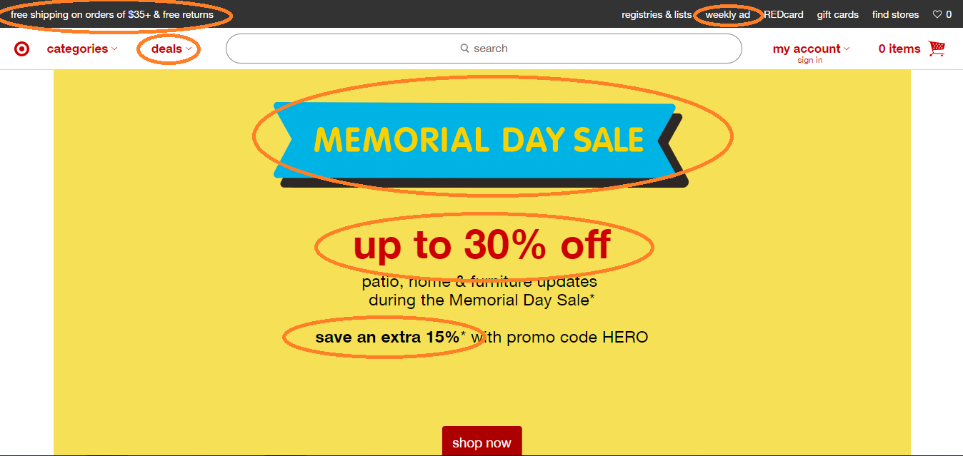
Target’s desktop homepage clearly hammers home the opportunity to save money six times. And there’s a sense of urgency — the best sales are only this weekend.
Pushing timely and relevant sales events via your eCommerce site is a powerful revenue generator — even if it does rack up billable hours with your web designer. Utilize the area below-the-fold to drive excited shoppers to the product categories that are relevant to them.
Target’s Tappable Tiles Make Mobile UX Design More Approachable
The mobile version of Target’s eCommerce site scores major points for their one-page Metro theme with hints that more savings are just a scroll away. Instead of a boring product carousel, images and brief text are aligned in colorful, eye-catching tiles that can be tapped for instant access to relevant product pages.
2. Nike’s Bold Imagery Draws Users In

Nike carries thousands of athletic products online. In a single image, they’ve summed up that their products are inclusive and diverse, support physical fitness, and exude a confident, sexy vibe. This message, framed within responsive web design, is the sum result of using their products in your life.
And, they aren’t waiting for you to order a product — they’re converting site visitors into Nike+ App downloads, ensuring an ongoing connection with their target consumers.
Nike Positions App to Strengthen Mobile Engagement
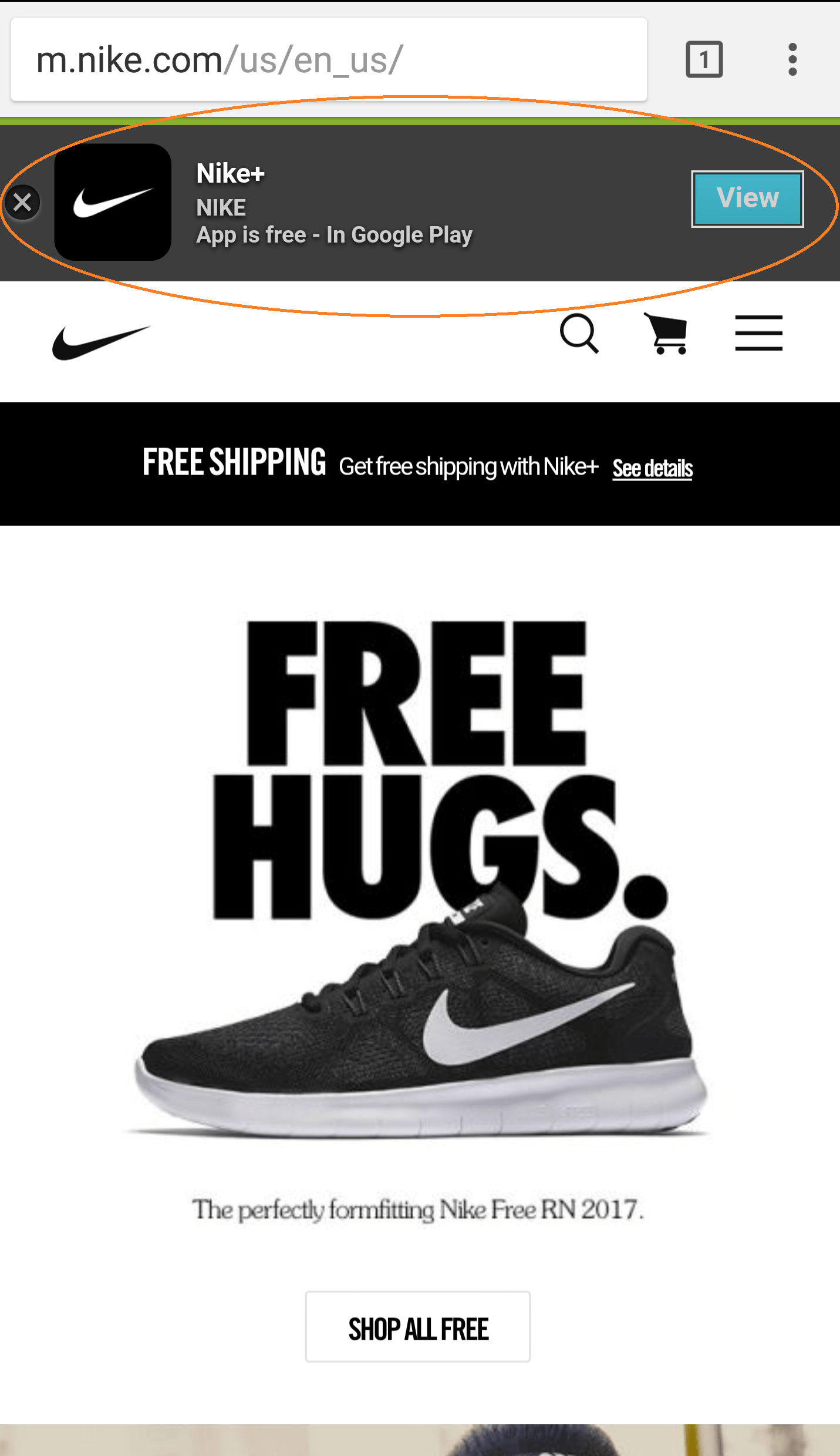
Dropdown ads on mobile eCommerce sites can help smartphone users engage more deeply with a brand. Nike’s fitness app, in this case, offers a conversion opportunity specifically tailored to mobile users. Responsive design is going away in place of mobile-first.
Get a native iOS and Android app for your online store
High-converting responsive checkout, eye-catching app icon, and quick inventory sync will create a truly delightful experience for your customers.
But, it’s important to adopt a balanced approach. App downloads could distract from their product line. An extra step has been added to the customer journey, placing distance between a site visit and a revenue-generating opportunity.
3. Zoffoli Uses Background Video to Communicate A Powerful Message

The human eye is drawn to moving objects. Zoffoli clearly communicates their core value proposition with a powerful statement and a video background that reinforces their message.
4. Dali Decals Uses Mobile App Icons to Engage Smartphone Users

Creating mobile-friendly icons, similar to the ones you’ll find on an Android or iOS home screen, is a great way to encourage mobile site visitors to interact with your site.
5. Standout Breaks Products Into Categories to Make The Search Easier

To ease into the process of discovering products, STANDOUT arranges the items into eight categories. Seamlessly blended elements make the layout intuitive without creating unnecessary distractions.
UX Tips for a Powerful eCommerce Homepage
Every eCommerce platform is unique and can be used to convey the vision and values of the brands they represent. In order to take advantage of the features and benefits of the platform, each eCommerce website needs to get a few things right before they can win over customers. This includes presenting products in a proven list format. Here’s my round-up of tips to consider when designing or redesigning your eCommerce site.
- Resist the urge to list everything on your homepage. Keep the page uncluttered by removing anything that isn’t immensely helpful.
- Ensure compatibility with desktops, smartphones, and tablets.
- Provide helpful links to your company’s contact details, shipping information, return policy, and terms and conditions.
- Focus on helping visitors self-identify and quickly access the information they need.
- Use high-level categories that are easy to navigate.
- Leverage uncluttered photos, accompanied by concise text to showcase your featured products and categories.
- Highlight a timely sale or promotion to create a sense of urgency.
- Showcase unique images and videos to highlight authenticity; avoid stock images.
PART II: Category Page eCommerce Website Design Examples
An effective category page is much more than a filtered product catalog. It’s a tool that allows you to communicate and engage with shoppers that are looking to browse through your products and focus specifically on the items in your custom eCommerce platform that can help them fulfill a need or desire.
You need to keep the visitor engaged, curious and excited about the products you offer. Let’s take a closer look at companies that get their category pages right, and a few that miss the mark.
1. Home Depot Takes Visitors on a Digital Journey Down the Store Aisle
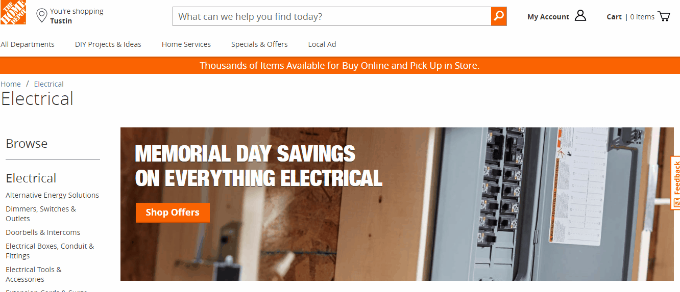
This is the “Electrical” landing page on Home Depot’s website. The vertical sub-category menu on the left-hand side provides instant access to more specific product categories. A banner highlighting a timely promotion gives the visitor a sense of urgency. Images are used to spotlight popular products.
Text density is only increased as the visitor scrolls down. This gives the page a clean, informative feel. In addition, the search engine optimization is implemented without cluttering the elements of the page designed to encourage conversion.
Home Depot Drops Extra Content (Including Images) To Speed Up Mobile Load Time

Slow page load times will kill user experience and cause bounce rates to skyrocket. Home Depot made the decision to drop the images and extra content, presenting viewers with links to the critical next steps in the product research process.
Home Depot might be able to get away with this low-effort strategy for increasing page load times because they’re a national brand with massive market recognition. While I would recommend dramatically slimming down the mobile version of your category page, you need to keep the user visually engaged with a more sophisticated, custom eCommerce solution.
Create a mobile eCommerce category page that is able to adapt your vital content to any screen size (responsive web design), keeping a few visual design elements to create a compelling user experience.
2. Amazon Leverages Data to Feature “Best Sellers” in a Category
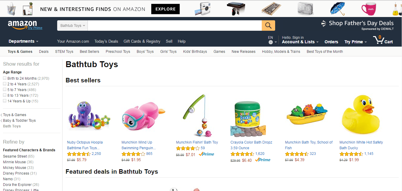
Amazon wins the eCommerce war by leveraging data in a way that delights consumers. You can take a page out of their book by creating a “Best Sellers” section at the top of your category page. Based on real-time data, this section should include product images, a hyperlinked title and customer rating information.
Clean, organized presentation of the items your visitor is most likely to buy is key for maximizing conversions using modern eCommerce website design.
Amazon Uses Horizontal Scrolling to Showcase Curated Product Carousels on Mobile Platforms

Amazon overcomes the traditional limitations of mobile viewing by providing visitors with the ability to scroll horizontally through curated product carousels. This means that more products can be showcased, without requiring a massive webpage that requires visitors to wander endlessly through irrelevant information.
3. Milani Uses Comparative Imagery to Showcase Products within a Category

The images Milani uses to showcase the products on their category page are powerful — both visually and contextually. Each product image is carefully chosen to provide viewers with product insights and shorten the time necessary to compare and select relevant products.
4. SportsMemorabilia.com – Turning Customer Passions Into Categories

SportsMemorabilia.com got inside of their customers’ heads to best organize their products and create relevant category pages.
Take a step back from your eCommerce website design and put yourself in your customer’s shoes: How would you like to be able to sort and filter the products on your site?
PART III: Creative Ecommerce Designs For Product Pages
A strong product page within an online store provides in-depth information about a product and converts the reader into a buyer. Product specifications should be readily available, as well as opportunities to customize the product.
1. Nordstrom – High-Resolution Photos and Language

Every product page needs a powerful photo to show off the workmanship that goes into an item. Nordstrom provides their customers with high-resolution lifestyle shots optimized at multiple angles and in a variety of scenes within their online store. The sophisticated language used to describe this high-end item is perfectly matched to the target customer. The product description text paints a visual in the reader’s mind that blends perfectly with the product images.
Nordstrom – Real-Time Mobile Product Customization

Nordstrom’s black and white product page, optimized for mobile devices, is elegant and clean, with a ton of white space. Selecting a color option instantly transforms the gallery images to match.
The Color Swatches addon for X-Cart will help you show different colors or fabrics of the same product.
Price: $125
Another important thing to note is that the Nordstrom App download option is placed in a way that doesn’t get in the way, yet encourages the shopper to make Nordstrom part of their app library.
2. Nike – Superbly Minimal and Inviting UX Design
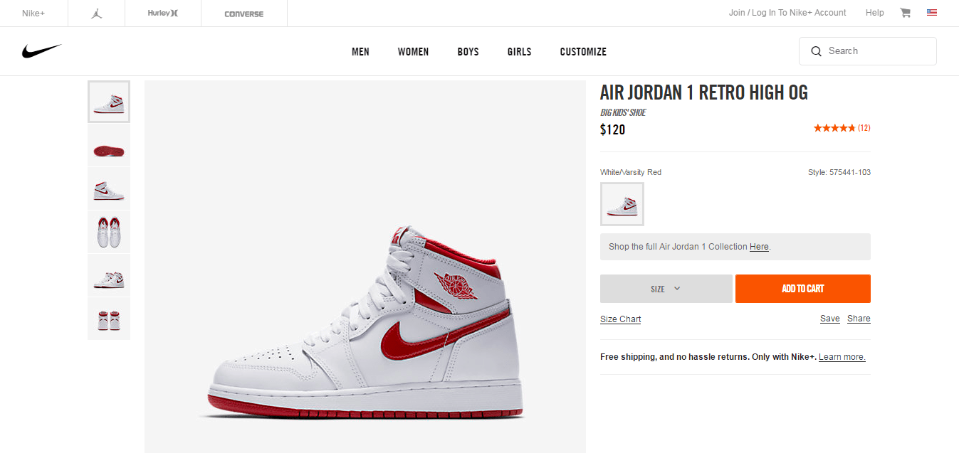
The more well-known your brand is, the more opportunities you have to say more with less. Nike is an international power player in the sports shoe industry. So, they made a statement by saying a lot less. The primary colors are shades of white and grey, giving the page an open, unintimidating feel. Everything required to build trust is there, minus anything that could be a distraction from the product’s legendary status in the market.
Magic Slideshow addon may come in handy if you are looking for a responsive slider that will automatically show your product images to your customers.
Price: $49
Detailed Images Slider is another fully-responsive and touch-sensitive slider, created by our precious friend and partner, Mike White.
Price: $35
Nike Provides The Best Tools to Remove Barriers to Purchase on Mobile Devices

Keeping the customer on your product page until they’re ready to click “Add to Cart” is vital for the success of your online store. Nike does this on their mobile site by providing visitors with a size chart. While simple, it removes the need for customers to research this kind of information elsewhere, improving the odds that a motivated shopper will make a buying decision without further delay.
3. Hunter Encourages Social Media Promotion
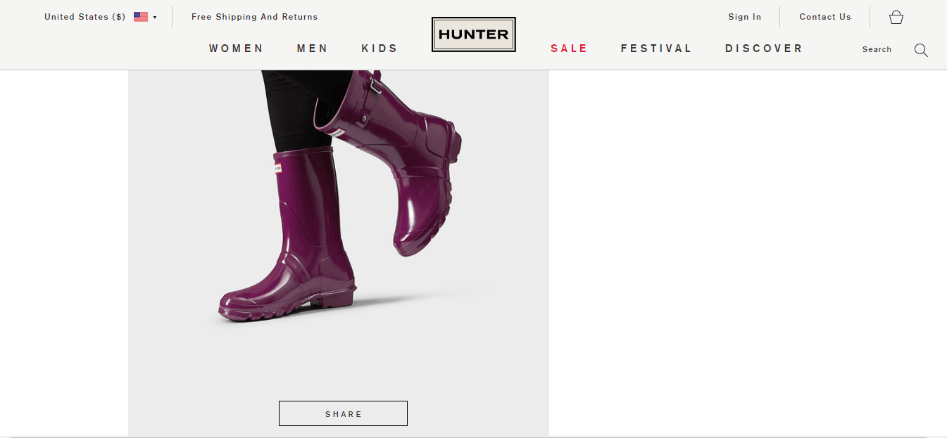
Each product page on Hunter’s site includes a ton of high-quality photos that showcase the products in action. At the bottom of every image, in a box that perfectly matches the eCommerce site template, there’s a clickable social media “share” button.
When properly executed as part of your eCommerce website development, this creates the opportunity for social selling. It’s important that design is taken into account so that these cues avoid distracting from the overall eCommerce website design of the product page.
4. Do it center – Creatively Displaying Product Inventory Levels
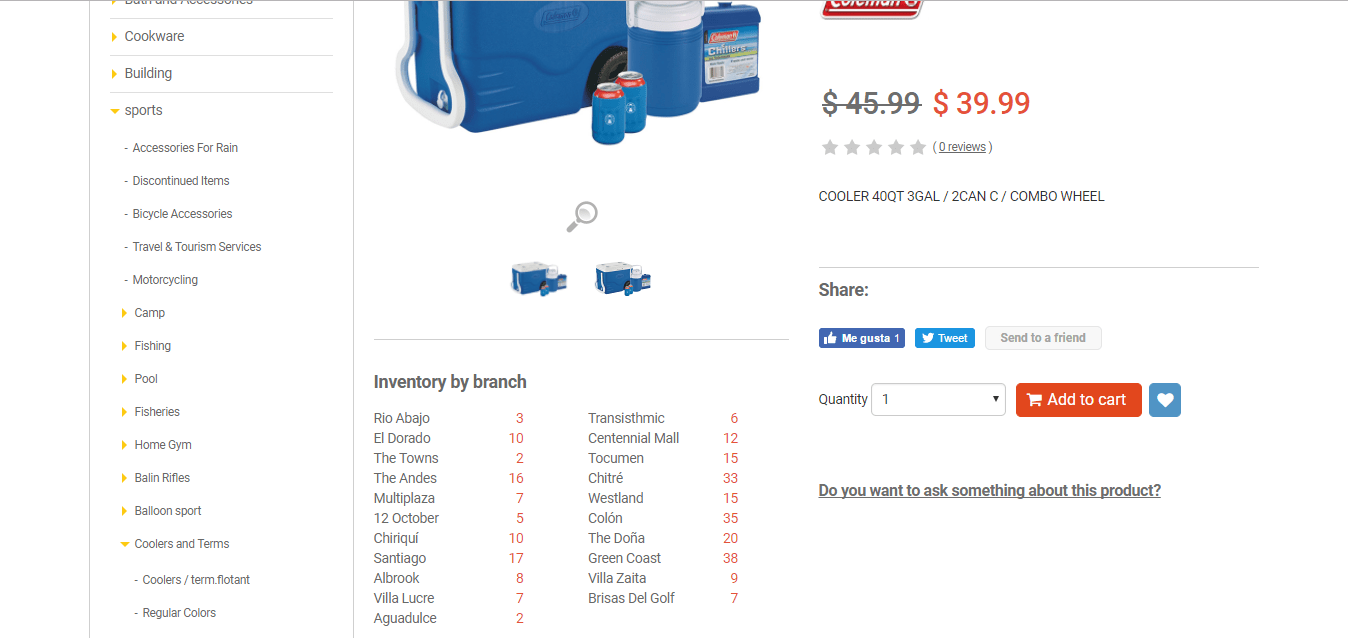
To help customers quickly find what they need, when they need it, Do it center provides real-time inventory levels on their website. Without cluttering the page, information is provided for both online and in-store inventory levels without the need to click to a separate page.
Plus, there’s a zoom option that allows buyers to enlarge product photos and view every single detail.
Enjoy a detailed close-up with the Magic Zoom app for X-Cart stores.
Price: $49
5. Bellroy – 3rd Party Testimonials Build Trust
6. Car iD – Reassures Buyers

If you’re selling customizable products or products that fit a specific car or part, you need to reassure buyers that they are getting the right one. Once you choose your vehicle, CariD reassures you that the product will fit.
You can also provide real-life experience through 3D modeling and augmented reality.
With 3D Modeling Services by CGTrader, your transition to AR will be as seamless as possible.
This allows users to visualize products and imagine what it might feel like to own the product before actually purchasing it.
10 out of 19 Experts Agree: Your eCommerce Product Page is the Most Important Page on your Site Because…
Essential Product Page Strategies
There are a few things that, if implemented correctly, can help your product page become the most powerful tool in your eCommerce arsenal:
- Ask your content marketer to include SEO and user-friendly content on each product page. Where this content shows up is dependent upon your design.
- Ensure that every necessary detail about your product is easily displayed to help customers reach a confident buying decision.
- Use page numbers to add context and communicate that you have multiple options to meet your customer’s unique needs.
- Empower buyers to filter your products by price, reviews, relevance which will help them leverage your selection based on their priorities.
- Layer content in a way that provides thorough details and leaves plenty of white space.
PART IV: Checkout Page Website Design Examples That Build Trust
The last step in a customer’s buying decision is to complete the checkout process on your eCommerce site after they’ve filled their cart up with everything they need. This is the moment of truth: Will they enter their payment details, or leave the payment gateway and abandon their cart?
Even if every other aspect of your eCommerce web design is perfect, the customer’s perception of this page decides whether you live or die.
1. JCPenney – Easy and Informative UI
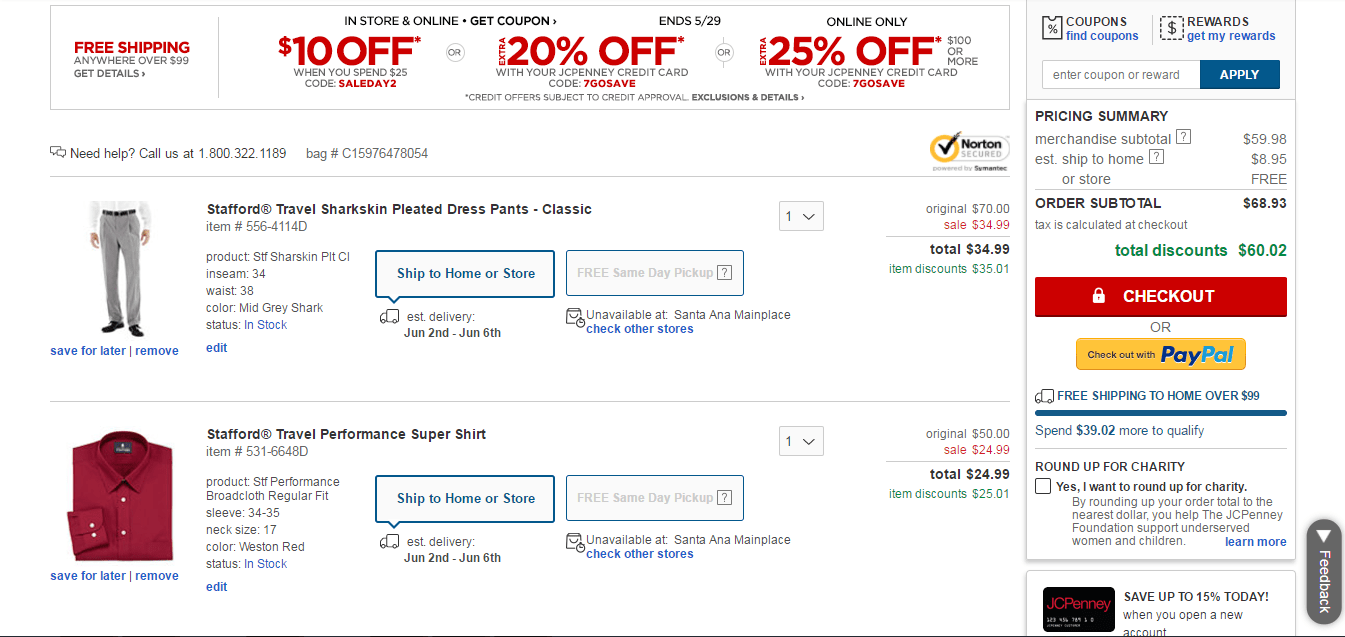
JCPenney provides everything a customer needs to confirm and process an order at a glance. I don’t have to scroll or search. Free shipping upsells and promotions are outlined at the top. Individual product details are neatly presented, and subtotals and totals are tallied to the right.
The use of graphic design, structured text, and easy-to-read font allow me to feel confident in my buying decision.
JCPenney – Emphasis on Help and Support in a Mobile World
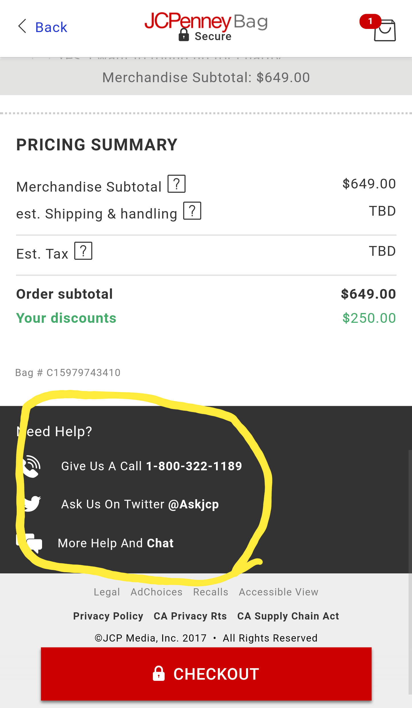
Trust and comfort, in part, comes from knowing that if something goes wrong, the company you’re dealing with has your back. At the bottom of every phase of the checkout, JCPenney gives mobile users multiple ways to reach out for immediate support.
While a customer might be filling their shopping cart from a smartphone, chat is a far more accessible way to get help in-the-moment.
2. GAP – Checkout for Returning Customers

Customers want to check out quickly, and so for returning customers, having to enter payment and shipping information into the system more than once is a major letdown. Allowing customers to log in and pick up where they left off in the checkout process is a key factor in building loyalty, making it easier to score repeat business in the future.
Gap – Mobile Checkout Ui Is 2000 and Late
Unfortunately, in the mobile arena, Gap’s mobile version of their checkout page is lacking. It fails to provide clear direction on how to process the transaction, relying on the user to realize that they need to click on each tab and fill in the previously hidden fields.
It’s almost like their web designer is stuck in the early 2000s. Requiring users to guess, without clear prompts, is a horrible way to close the deal online. If the information they need is hidden in an outdated eCommerce solution, don’t expect a high percentage of purchase completions.
3. 6DollarShirts – An Easy-To-Follow Checkout Process

From the moment a user clicks “checkout” in their eCommerce store, they’re presented with a transparent, easy-to-understand checkout page that’s intuitively designed to guide the purchase across the finish line. What is more, there are no bright colors or distracting pop-ups, that can lead to checkout abandonment.
By the way, have you noticed that the logo is everywhere in the examples we’ve presented? So, as much as you care about your web design, you should also think of your logo. Here’s our guide on creating a logo online.
4. BloomThat – Just an Oh-So-Beautiful Credit Card Checkout Design

This BloomThat check out is all about good, eye-pleasing design. And though it is custom-made (and checkout forms are quite challenging to customize!), it is quite user-friendly.
Payment options are neatly placed at the very bottom of the page and do not distract buyers from the purchasing process.
The neat summary includes all the necessary information about the product: name, address, delivery time, taxes, total, personal message, and, of course, a picture of flowers.
5. Airbnb – Clean and Clear Checkout Design

Airbnb Plus has one of the best eCommerce web designs I’ve ever seen.
Every step of the checkout process is well thought out, and there’s nothing that can distract travelers from purchase. Cleaning fee, service fee, additional taxes, and the total price — you clearly understand what you are paying for.
The brand color of the call-to-action button and the review stars naturally complement the simplicity of the checkout pop-up.
eCommerce Cart and Checkout Design Tips
You’re on the fifty-yard line and the quarterback just yelled “HIKE!” Will your great eCommerce site be able to score the sale? Implement these strategies to ensure your cart and checkout pages are up to the challenge.
- Confirm every product detail as part of the cart review process.
- Complete the checkout process without hiding the cart.
- Help users quickly return to view the product pages for items in their cart.
- Provide customers the option to check out or continue shopping.
- Don’t ask for personal or payment information before asking the customer to confirm the contents of their cart.
- During checkout, only ask for information that’s vitally necessary to the fulfillment of their order — respecting privacy builds trust.
Part V: Beautifully Designed About Us Page Examples

If you think that your About Us page should not be taken too seriously, think again. A beautifully designed About Us page is your chance to make a positive and long-lasting first impression and highlight your strong points.
It’s also a mistake to think that customers stick to your product page only without taking a closer look at the company itself before proceeding to checkout.
The About Us page is as vital as your homepage or checkout page or any other web page of your eCommerce website. (Unless you stick to selling on Amazon — or your brand is already as popular as Amazon.)
So the general idea for a brand is that you should craft a visually attractive e-commerce About Us page with an intuitive UX and a friendly layout.
Below are five eCommerce About Us page design examples that will inspire you and help build trust with your potential buyers.
1. Chillblast Uses Video on About Us Page to Be Convincing

Instead of just filling your About Us web page with plain text, jazz it up with some visual content. A short video, for example, with you, the business owner, as the speaker.
It works perfectly for those customers who are too busy to read but ready to spend a couple of minutes listening to your story.
A video is a great way to feature customer testimonials and the products you sell while demonstrating that there’s a real person behind this eCommerce business.
In fact, it’s one of the best web UX hacks as it looks great on your web page and immediately attracts your users’ attention.
Ben Miles, managing director at Chillblast, designed a quick video about his business and wisely placed it on his About Us page.
2. ZipHearing – Introduces The Team

There’s no need to hire a web designer to make your About Us page more personal. Get your buyer acquainted with your team, just like ZipHearing does.
Disclosing your (smiling!) face and the faces of your colleagues will make your customer feel at ease.
Don’t be too shy to include some offbeat details about your team. This information will catch your customer’s eye and stick in their memory.
For example, your customer support rep loves doughnuts more than anything else. Or your head of sales jumps on the table every time he or she makes a big sale. Write about that.
These small details will also make your customer journey a bit smoother.
3. WeBuyBlack – Appeals to Social Values

Sometimes a single sentence along with a story-telling picture can describe your eCommerce business better than an extensive article.
Think clearly how you can communicate your vision to your target audience with the help of UX and intuitive layout. Let your website design reveal your social and economical values.
WeBuyBlack, an eCommerce marketplace for black-owned businesses did it the right way. They designed a picture that reflects the nature of products sold on their marketplace, placed it on the eye-catching juicy background, and wrote good copy that’s brief but hard-hitting.
4. Flowers Online 24 – Flags Their Physical Location

Having an online business does not mean your products cannot be discovered offline.
If you have a brick-and-mortar store, design your eCommerce About Us web page with offline shoppers in mind. It would be wise to let your customers locate your retail store easily.
Find a cozy place for a map and write your store’s address and hours of operation beneath it, just like FlowersOnline24 did. This will make it easier for your customers to navigate straight to your store after making an online purchase.
Adding an email could potentially make the process more complicated for your customers, so I would replace it with a Contact Us form.
Advanced Contact Us Form for X-Cart will add a beautiful map with the road to your store. You’ll also be able to add additional info such as working hours, links to social accounts, working hours, etc.
Price: $69
5. OakHall Shares the Store’s Timeline

If your brand has a time-honored history, consider yourself lucky — you’ve got a chance to make your About Us page design as creative as possible.
Take a look at OakHall’s timeline. Isn’t it great? The whole story of the company dates back to 1859. I couldn’t even take a screenshot of the full page as it would have made this article endless.
All the information is presented in a compelling yet honest way. The events are arranged vertically and the most important ones are illustrated with pictures. To make the experience more immersive, the brand-specific events are accompanied by the most significant moments in history, like Atlantis’s final landing at Kennedy Space Center.
While sharing your story, remember to inform your customers where you were at the very beginning, how you’ve managed to overcome the hurdles on your way, and how your company can solve their problems. If you make them laugh — or cry — you’ve reached your goal.
Great Design Tips for an eCommerce About Us Page
Crossing a busy road is not scary if you look right and left beforehand. The same goes for your website. Building a memorable About Us web page design is a piece of cake if you follow the rules.
Implement the following tips and strategies to show the awesomeness of your eCommerce business to the world around you.
- Add a brief 1-3 minute video telling the story of your brand.
- Personalize your shopper’s experience by adding photos of your team.
- Share the human side of your business with the help of stories.
- Let design translate your company’s values through colors and copy.
- Add a map to make it easy for customers to locate your physical store.
- A beautifully designed timeline can show the history behind the company.
- Appeal to emotions and make people laugh — or cry (in a good way!).
Part VI: Search Results Page eCommerce Web Designs That Help Find Products

Search results page design can either make or break your eCommerce website.
If your search bar delivers the results in a straightforward way, allows for flawless filtering, and easy sharing, then just skip this chapter — you know it all.
If your site search user experience is not up to the mark and your customers are still struggling, it’s time to get down to business and improve it right away.
Just imagine, according to Forrester’s Research, 43% of your site visitors got immediately to the search box. Moreso, those who use search are 2-3 times more likely to convert compared to those who do not.
Do not let users miss your products because of the unscannable search results page design. Below are a few examples of best search results page designs that convert occasional visitors into standing customers.
1. Dynamic Office Solutions – Detailed Search Results Pop Up

There may be thousands of products in your eCommerce site, but your customer may never stumble upon them if your website search design is subpar. The impact of a bad search results page is quite predictable — lost sales, outrageously high cart abandonment rates, and ultimately one unhappy store owner.
Dynamic Office Solutions managed to bridge the gap between the user and the extensive content they are offering in their online store.
With the help of our CloudSearch eCommerce search engine, they masterfully narrow the results to the specific products a user is looking for. To make sure the search results are correct, they also perform the search within categories and pages.
Pictures, product details, and prices make it easier for customers to make a balanced purchase decision.
2. PearlsOnly – Uses Pearl Wizard To Make Shopping More Personalized


The more you know about your target audience, the more customer-oriented your business can be.
Pearls Only gathers information about their user preferences in a game-like manner, offering to fill in a quick form. Based on the answers they get, they offer a personalized product, that, as they think, would fit perfectly.
The best thing about this search wizard design is that users can see the progress bar (i.e. estimate how long it will take), send their results to their mailbox, edit answers, and even get free expert advice.
3. Giftmandu Helps Filter Results Wisely

Advanced filtering gives the shoppers the opportunity to conduct their own research and sort the products the way they feel like, not you. Design your search results page with various filtering needs in mind.
Giftmandu lets their customers filter the search results according to their preferences, including category, brand, tags — you name it. Filtered search results can further be sorted by rates, sales, price, recommendations, and so on.
4. STANDOUT – Creates Awesome Mobile Search UX

According to Statista, 63.4% of all web page views are made through mobile phones. It’s no longer a secret that your eCommerce website design should reflect all the modern tendencies and be mobile-ready.
Standout, a men’s designer fashion store running on the X-Cart eCommerce platform, does not use the native CloudSearch app. It does, however, allow for smart search results filtering. What is more, the responsive layered navigation works perfectly both on mobile and laptops.
Every pixel is designed to create a pleasurable user experience. The filtering is fast and intuitive. And if anything goes wrong, there’s always a helpdesk phone number you can dial to get immediate support.
Web Design Tips For eCommerce Search Results Page
Modern customers are looking for immediate search results. They are not inclined to wait for more than three seconds. Follow these simple tips to make your website search UX speedy and convenient:
- Offer advanced search options to get your products found no matter what your customer is looking for.
- Enhance your eCommerce search design with product pictures.
- Offer immediate support if no products are found in the search results.
- Learn as much info about your shoppers as possible to make the search results highly relevant.
- Use the advanced tools that filter search results like a pro.
- People use their smartphones more often today, so take time to make your search design responsive.
Part VII: Examples of Login Form Designs For Your Inspiration

The sign-in form design is one of the most essential elements of your e-commerce website. You have to think it through very carefully before even launching your online store.
A cluttered login form with poorly designed UI is likely to turn your prospects away from a purchase. A beautifully designed sign-up form will encourage them to become a member of your community, a customer, or a subscriber.
Below are a couple of highly-effective and attractive login form design examples that should inspire you and help you build your email list.
1. PearlsOnly – Quiz on Sign Up to Build Email List & Boost Loyalty

Let me start this chapter with an unusual example: a sign-in form designed by PearsOnly in the interactive quiz format.
This welcoming and attractive login form makes it impossible to pass up. A purple roulette promises you to win a full price discount if you register for their eСommerce site.
This option is available for $99 with the Coupon Roulette app for X-Cart stores.
It offers a speck of humor for those who hate ‘fun & games’ and a robust call to action button answering the question ‘I want to…’ from the user’s perspective.
Would you spin the wheel if you had a chance to save big?
2. GitiOnline – Offering Additional Discounts For Mobile Sign Ups

GitiOnline is another beautifully designed shop built with X-Cart. What differs them from the crowd is that they sign their customers up using mobile phones. This way, in addition to email newsletters, they will send SMS notifications, thus keeping their customers up to date with company news.
The sign-up form design is quite simple — a charming lady on the left, and a couple of fields to fill in on the right. And, of course, they didn’t forget about the GDPR law and ask every subscriber if they agree to receive transactional and promo emails.
3. TOMS – Offers Several Options to Choose From

TOMS, the global shoe retailer, makes the login process easy for both types of shoppers — returning and the new ones. If a visitor has been there before, he or she is able to quickly login for faster checkout and order tracking. If it is a new subscriber, then they are free to choose one of the most convenient options for registration.
I just wonder why I can log in using Facebook, Google+, and Twitter, but registration is possible only with the first two social media networks. Taking into account that G+ is more dead than alive, only one means of registration is left.
4. BirchBox – Seduces Potential Visitors With Quality Pics on Signup

Every designer knows that the impact of images in interface design is colossal. Visually attractive pics push customers to checkout, while poorly-created ones leave a sour taste in the mouth.
BirchBox knows their target audience perfectly — they are visually stimulated and enjoy seeing (as opposed to reading or listening or anything else).
An attractive yellow and orange box along with cosmetic products catch users’ attention. A short line of copy explains the value they bring to the user, which is also important.
5. Glass Packaging Solutions Offers Quick Sign Up Through Social Media

Social login is a proven way to improve conversions across web and mobile platforms. It gives shoppers an easy way to sign up for a service without filling email and password fields, confirming your registration, and then entering your email and password again to log in.
The Social Login app will allow your customers to easily sign in using Facebook and Google accounts.
Price: Free
Glass Packaging Solutions designed their login/signup form in a way that is convenient for both — those who prefer to sign in the classic way and those who want to quickly log in via existing Facebook, Google, or PayPal accounts.
UX Tips For eCommerce Sign-in Form Design
Sign-in form design matters immensely for eCommerce sites, especially for small businesses.
According to the CXL study, store owners observe a 68% increase in user engagement after implementing social login. This small but useful option also reduces the number of failed login attempts and password reset requests.
There are lots of other design hacks that you can use to make your eCommerce login form more attractive to your potential buyers.
- Surprise your website visitors with a funny game on sign-in. The first impression is the one that lasts forever.
- Tempt new users to share more info about themselves by offering discounts.
- Stimulate sign-ups with incentives available after registration only.
- Offer different sign-in options both for registered customers and newcomers.
- Seduce your website visitors with an appealing website design upon sign-in.
- Let people quickly sign up using social login.
Part VIII: Email Newsletter Form Designs That Convert

What is a cleverly designed newsletter form? It is the one with a clear concept, thoughtful approach, and persuasive copy.
Spend more than a few minutes to plan the newsletter form layout. Think up an effective call to action, and then ask your team what they think about the copy.
Take a look at the following six email newsletter sign-up design examples that should give you an idea of a better way to convert visitors into standing customers or subscribers.
1. Barnyarns Value-Focused Newsletter Subscription Form

A newsletter subscription form is another way to collect emails from people that are potentially interested in your products or services. And, quite clearly, it should explain the reason why your would-be customers should disclose their emails.
With 400+ customizable templates to choose from, the Wufoo integration will help you design beautiful forms for your X-Cart store.
Price: $39
Above is an example from Barnyarns and how they’ve unleashed the value behind their educational newsletter subscription. They claim to send tips, how-tos, exclusive offers, and some valuable info about new products.
MSIA’s Newsletter Subscription Form Clearly Explains Value

Here’s another newsletter form design focused on value and user preferences by Movement of Spiritual Inner Awareness.
Their motto is quite straightforward: They promise to send inspirational quotes once a day. Plus, there is a simple CTA button that matches their logo and brand style in general.
LEGO’s Newsletter Form Answers The Question ‘Why?’

There is much to admire about the way LEGO uses digital marketing, with lots of shareable content, engaging social media posts, and dozens of mobile apps.
LEGO site design is also top-level. An eye-catching yellow banner prompts users to subscribe to shop promos and be the first to hear about brand new sets, exclusive products, promos, and events.
2. Ecwid Is Upfront About the Email Frequency

As we can see, Ecwid eCommerce website builder brings attention to the frequency of emails. They promise not to bother their subscribers with long-winded memoirs — just a single email once per week.
What is more, the pop-up image immediately introduces the topic of the newsletter in a direct way.
This newsletter form design may seem to be rather primitive. However, it adequately serves its primary purpose, collecting emails in a friendly, non-intrusive way.
3. WrestlingShop Appeals to Emotions

Emotions play a vital role in decision making. If you manage to establish an emotional connection with the user through eCommerce website design or copy you are likely to have more returning customers in the future.
Done well, emotional design increases engagement and creates an enduring and delightful feeling about the products you sell.
Richard Coogan, the founder of Wrestling Shop, knows that and uses it in every step of the marketing funnel. And what I love most of all is the call to action (CTA) button telling users how awesome they will be if they subscribe to the newsletter.
4. Neil Patel Quiz-Like Newsletter Form Design

Adding quizzes inside your newsletter subscription forms has proven to be one of the most effective methods of lead generation.
That’s what Neil Patel does to grow the email list on his personal website. And who knows how to create eye-catching newsletter form designs better than the guru of marketing?
His subscribers can win an SEO cheat sheet, million visitors a month, or even a call with his team. Though some of the options seem quite ultimately unrealistic, I cannot deny the fact that this bright orange wheel of fortune does attract attention.
Email Newsletter Form Design Tips For eCommerce Businesses
No doubt about it, there are a lot more trends in newsletter signup form designs. Your choice should be based on your preferences. Some online store owners prefer to go for the minimalist style with a few lines of text and a clear call to action. Others think outside the box and create an unusual subscription box to attract the newcomers.
Here are some of the most critical aspects you should keep in mind:
- Explain the value of your newsletter to your subscribers-to-be.
- Inform about the email frequency — people hate getting emails too often.
- Trigger emotions. This way, your brand will stick in people’s minds.
- Get creative.
Is Your eCommerce Site Up to the Challenge?
It’s my hope that you’ve learned a great deal about eCommerce website design and the factors that influence customer trust online. Tweaking and optimizing an eCommerce site is a constant process. And you should be searching for inspiration anywhere you go — online or offline.
With powerful open-source eCommerce tools, like X-Cart, the possibilities for your eCommerce site are endless — even if you aren’t a web designer with decades of experience. Your shopping cart software matters. Find out why we are the best eCommerce platform for developers.
40+ Ready to Use eCommerce Templates
No matter what type or how large or small your business is, chances are that you’ll find the perfect theme for your online store. There are more than 40 mobile-ready ecommerce templates for various types of businesses, including clothing stores, food and delivery organizations, educational sites, and so on.
A Bevy of Tools For Easy Customization
The best thing about these templates is that they are fully customizable. Even if you are not much of a developer, there is a full range of tools to help you tweak the layout without much coding.
Theme Tweaker is an easy-to-use app that will allow you to customize CSS styles and Javascript codes right on your storefront. Convenient drag and drop functionality will let you move layout blocks with no coding at all.
Price: Free
Custom Skin is the so-called ‘empty’ eCommerce theme that allows you to create a unique design for your store from scratch but provides you with all the needed tools to make the entire process easier.
Price: Free
Webmaster Kit is another useful tool that was once for internal usage only but is now shared with all the store owners. The goal is to make the process of addon and template development a bit easier for webmasters.
Price: Free
Unique Design From Scratch
No worries if none of the existing eCommerce themes float your boat. This is normal. Here at X-Cart, there is a team of professional website designers who will create a custom-made design that will meet your unique business needs.
Converting Your Design Into a Custom Skin
Aha! You’ve narrowed down your design ideas and have got something to share. Superb! We’ll work some magic and convert your design into a mobile-friendly online store.
Partners
And, of course, we’ve got friends who help us launch online stores.
For example, Just X-Cart, an Australian-based agency with over 10 years of experience, will help you design, set up, and launch a store with X-Cart.
Additional Design Services
- If you are still stuck with an outdated layout that looks distorted when viewed on mobile devices, we’ve got you covered.
- If your site is not Retina-ready yet (and it should be in 2020), we’ll adjust your graphics and yet keep your page load time down.
- Adding shopping functionality to an existing website is a piece of cake.
- Holidays coming up? We’ll help you bring the holiday spirit to customers in a fun, new way.
- Build an eCommerce brand that stands out in a crowd of mundane competitors.
See the full list of web design services
Responsive Site Design Results in Steady Growth
The ability to hire your design team was also a big plus by bringing my vision to life.
In April of 2017, we revamped our website and added even more advanced features. Our new adaptive screen resolutions provide a smooth ordering process from tablets and smartphones.
We are happy with the design. It is so clean and simple which makes our eCommerce website stand out in the crowd of competitors. And it makes our customers’ hearts go boom.
About the author

Darren DeMatas
Social Activist, Entrepreneur, Ecommerce Investor, Agency Founder
Co-Founder at Ecommerce CEO and Orbit Local, Board Member at Three Grains of Rice Missions, Darren has an MBA in Internet Marketing and 10+ years of experience marketing retail, manufacturing, and Internet marketing corporations, 7-figure brands and startups online.


Subscribe to Our Newsletter
to Get Expert-Backed Tips Straight Into Your Inbox


