

14 min read
The What, How, and Why of a Mobile-First Web Design for Auto Parts eCommerce Businesses

6 min read
Did you know that the share of mobile eCommerce has been steadily climbing from just 56 % in 2018 to an expected 62 % in 2027, as per Statista? The growing number of US consumers using mobile phones to shop online has transformed the UX approach to eCommerce website designs, bringing small screen sizes to the fore and putting mobile customer experiences in the driver’s seat.
According to the Porch Group Media survey, online auto parts buyers are becoming increasingly comfortable searching for products via mobile devices, with 43% comparing pricing, 43% looking up reviews, and 41% reading product specifications.
For car parts sellers, prioritizing mobile designs for their online storefronts is essential to keep up with the latest consumer trends and stay competitive.
In this blog post, we’ll break down what the mobile-first approach is, how designing for mobile benefits auto parts online stores, and why neglecting this strategy puts your eCommerce business at risk.
What Is a Mobile-First Strategy?
As the name suggests, the mobile-first concept involves building a website for smartphones and tablets first, then scaling up the mobile version for larger screens.
Mobile-First vs. Mobile-Responsive Design
Although the mobile-first and mobile-responsive concepts might sound similar, they are not interchangeable.
A responsive web design, which is built for desktop users and is then adjusted to fit mobile devices. In contrast, a mobile-first strategy implies planning and designing an online storefront with proactive changes to the overall website layout to ensure the mobile experience is as good as the one on the desktop.
Thus, mobile-first interfaces better cater to user convenience due to various factors considered during the design process, such as white space, font size, and web page load time.
Still, both approaches are widely applied by eCommerce designers, and most API-driven shopping cart solutions (and X-Cart is no exception!) now offer mobile-first and mobile-responsive design templates and storefront customization options. So, it’s up to business owners to decide which would better suit the company’s goals in terms of affordability and implementation options.
In a nutshell, a mobile website contributes to brand loyalty and aids in customer retention and SEO efforts, leading to a higher conversion rate and expanded customer base. But here comes the challenge of ensuring your mobile storefront would intertwine your complex auto parts data and a seamless buyer experience.
With automotive industry needs in mind, X-Cart has rolled out the new AutoMobile design theme designed for mobile users, yet also working perfectly on desktops!
X-Cart Automotive Demo (Mobile view)
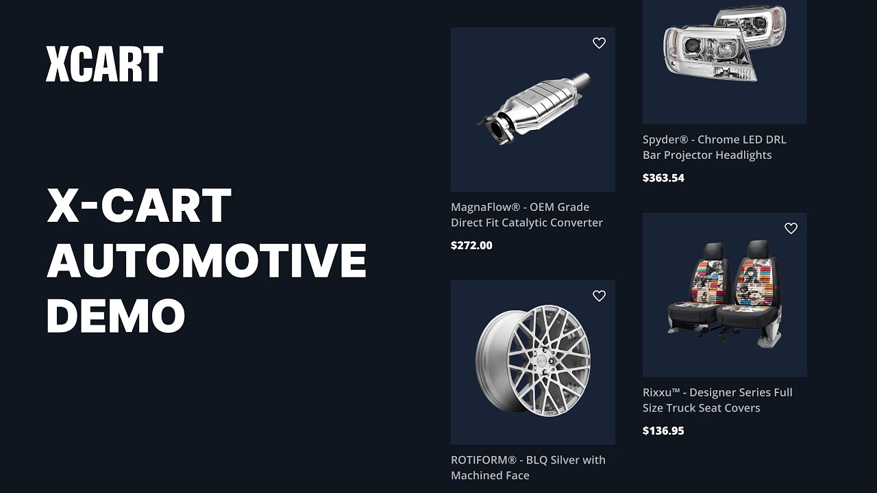
X-Cart Automotive Demo (Desktop view)
This mobile-first template is an excellent choice for any automotive aftermarket parts shop, whether you sell wheels and tires, engine parts, or auto accessories. In addition, this theme was created to work seamlessly with the Year/Make/Model fitment search tool and VIN lookup, making the purchasing journey simple and transparent.
Ready to Go Mobile-First with X-Cart?
Pros and Cons of a Mobile-First Design Approach to Your Automotive Online Store
If you’re still unsure whether you need a mobile website for your auto parts business, weigh the pros and cons of implementing a mobile-first approach.
| Mobile-first benefits | Mobile-first challenges |
| ✔ better website performance | – staying updated with mobile technologies |
| ✔ higher google rankings | – balancing mobile-first design with complex auto parts data filtering |
| ✔ increased customer loyalty | – accessibility issues for users with older devices |
| ✔ extended omnichannel opportunities | |
| ✔ competitive advantage |
5 Solid Benefits of Going Mobile-First
1. Better Website Performance
Mobile-first design implies using scalable, high-quality images, streamlined content, and a clear navigation menu on your landing pages. Nothing extra, just simplicity and functionality. This overall design optimization contributes to faster page loads on mobile devices.
2. Higher Google Rankings
Since more and more internet users are starting their product search through mobile phones, Google has introduced mobile-first indexing and web page ranking. This is where the professional look of your auto parts eCommerce store and faster page load times increase your chances for higher positioning on a Google search results page, opening up doors for new online sales.
3. Increased Customer Loyalty
Mobile-first and mobile-friendly websites meet today’s customer expectations, contributing to long-term brand loyalty for automotive online businesses. The key benefit lies in the ability to interact with online shoppers in a more effective and user-friendly way, ensuring comfortable browsing on a device of their choice.
4. Extended Omnichannel Opportunities
Automotive businesses generally embrace an omnichannel approach and need a responsive design across all their digital platforms. With a focus on mobile-first, you can deliver optimal user experiences that support your marketing efforts and boost mobile sales.
5. Competitive Advantage
According to ROI Revolution, mobile visitors make up 65% of total traffic to auto parts and accessory websites. At the same time, online sales of new auto parts and accessories purchased via mobile devices increased by 40.2% in 2022 compared to 2020. Thus, e-retailers who have optimized their eCommerce sites for mobile shoppers have higher chances of tapping into this growing customer pool and expanding their business reach.
Potential Challenges of a Mobile-First Design
1. Staying Updated with Mobile Technologies
Mobile technology constantly evolves, which sparks the challenge of keeping up with new devices and continuously optimizing the design to ensure it perfectly fits various screen sizes.
2. Balancing Mobile-First Design with Complex Auto Parts Data Filtering
Mobile-first design can conflict with other business priorities, such as complex catalog data and quick and accurate product search filtering options. (However, this is not your challenge if you choose to use any of the X-Cart automotive themes.)
3. Accessibility Issues for Users with Older Devices
Mobile interfaces can sometimes be inaccessible to users of older devices. As a business owner, you must analyze your target audience and implement a UX design that meets your clients’ accessibility demands.
Best Mobile-First Practices for Your Online Store
To deliver a satisfying shopping experience for customers, address all the aspects of your mobile, including speed, aesthetics, responsiveness, and a streamlined navigation process with minimum clicks required.
Ensure you have all the important elements of a mobile-first storefront by following these simple practices:
- Design a simple, uncluttered layout that is easy to navigate and pleasing to the eye.
- Optimize web page content that highlights the most prominent information.
- Follow visual hierarchy principles to arrange visual elements and navigation icons according to their importance.
- Use finger-friendly, sticky Call-to-Action buttons that capture customers’ attention, when they are using a small screen.
- Add high-quality, vertical product images.
- Optimize your mobile website speed to avoid losing potential customers.
- Test your mobile design to gather customer feedback on how they navigate your website and make adjustments.
Key Takeaway
A mobile-first approach to designing online storefronts is no longer just a trend but a crucial component of online success, sustainable sales flow, and long-term business growth. The trickiest thing is implementing the design that would align with your unique business specifics, customer needs, and automotive industry requirements.
At X-Cart, we offer ready-made storefront themes designed explicitly for automotive businesses and optimized for mobile website visitors. We can also implement a custom storefront design to cater to your brand guidelines while ensuring simple navigation and filtering for your mobile shoppers.
Need a Custom Mobile-First Design for Your Automotive Store?
About the author

Maria
Contributor
Maria is a marketing manager who discovered her passion for digital and content marketing during her student years — and has been immersed in it ever since.


Subscribe to Our Newsletter
to Get Expert-Backed Tips Straight Into Your Inbox

